ShopDreamUp AI ArtDreamUp
Deviation Actions
Comic Page previews
Support my work by contributing to my tip jar. This tier includes exclusive "behind the scenes" pictures, which means you get to see future Comic-pages before their finishing-touch and more!
$2/month


Suggested Deviants


Suggested Collections
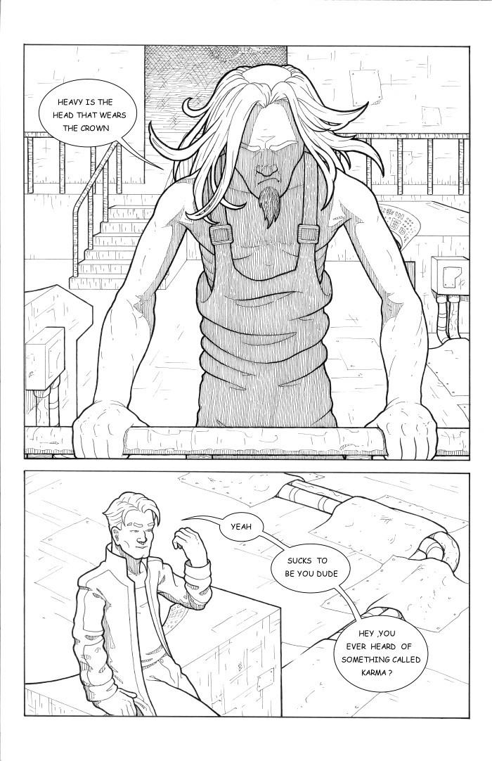
![[My Tallest] Page 01](https://images-wixmp-ed30a86b8c4ca887773594c2.wixmp.com/f/5cfac37d-ed68-4a86-8f69-4a6410a179b2/da8ihe5-59fffcd8-a9c6-4451-8ac0-72fc835dd2f6.jpg/v1/crop/w_184,h_184,x_0,y_16,scl_0.074193548387097,q_70,strp/_my_tallest__page_01_by_space_tanukis_da8ihe5-92s-2x.jpg?token=eyJ0eXAiOiJKV1QiLCJhbGciOiJIUzI1NiJ9.eyJzdWIiOiJ1cm46YXBwOjdlMGQxODg5ODIyNjQzNzNhNWYwZDQxNWVhMGQyNmUwIiwiaXNzIjoidXJuOmFwcDo3ZTBkMTg4OTgyMjY0MzczYTVmMGQ0MTVlYTBkMjZlMCIsIm9iaiI6W1t7ImhlaWdodCI6Ijw9ODEwIiwicGF0aCI6IlwvZlwvNWNmYWMzN2QtZWQ2OC00YTg2LThmNjktNGE2NDEwYTE3OWIyXC9kYThpaGU1LTU5ZmZmY2Q4LWE5YzYtNDQ1MS04YWMwLTcyZmM4MzVkZDJmNi5qcGciLCJ3aWR0aCI6Ijw9NjAwIn1dXSwiYXVkIjpbInVybjpzZXJ2aWNlOmltYWdlLm9wZXJhdGlvbnMiXX0.XXX4P3nFhjyB-qYeuY8BJfdALJi8b_2TSF9PxQGWch0)
![[My Tallest] Page 01](https://images-wixmp-ed30a86b8c4ca887773594c2.wixmp.com/f/5cfac37d-ed68-4a86-8f69-4a6410a179b2/da8ihe5-59fffcd8-a9c6-4451-8ac0-72fc835dd2f6.jpg/v1/crop/w_92,h_92,x_0,y_8,scl_0.037096774193548,q_70,strp/_my_tallest__page_01_by_space_tanukis_da8ihe5-92s.jpg?token=eyJ0eXAiOiJKV1QiLCJhbGciOiJIUzI1NiJ9.eyJzdWIiOiJ1cm46YXBwOjdlMGQxODg5ODIyNjQzNzNhNWYwZDQxNWVhMGQyNmUwIiwiaXNzIjoidXJuOmFwcDo3ZTBkMTg4OTgyMjY0MzczYTVmMGQ0MTVlYTBkMjZlMCIsIm9iaiI6W1t7ImhlaWdodCI6Ijw9ODEwIiwicGF0aCI6IlwvZlwvNWNmYWMzN2QtZWQ2OC00YTg2LThmNjktNGE2NDEwYTE3OWIyXC9kYThpaGU1LTU5ZmZmY2Q4LWE5YzYtNDQ1MS04YWMwLTcyZmM4MzVkZDJmNi5qcGciLCJ3aWR0aCI6Ijw9NjAwIn1dXSwiYXVkIjpbInVybjpzZXJ2aWNlOmltYWdlLm9wZXJhdGlvbnMiXX0.XXX4P3nFhjyB-qYeuY8BJfdALJi8b_2TSF9PxQGWch0)


You Might Like…


Featured in Groups


Description
Next page : Spacedogs2-pg30
Previous page : Spacedogs2-pg28
First page: javandrews.deviantart.com/art/…
If you are new, here's a link to Chapter 1

© vince andrews 2014
Previous page : Spacedogs2-pg28
First page: javandrews.deviantart.com/art/…
If you are new, here's a link to Chapter 1
© vince andrews 2014
Image size
700x1082px 209.93 KB
© 2014 - 2024 VinceAndrews
Comments18
Join the community to add your comment. Already a deviant? Log In
Overall this page is great. It has great use of composition, perspective and texture. It really creates a sense of place with depth and feels solid.
Your character design is also awesome. I think you really excel at facial expressions and posturing. Their body language and poses feel natural and compliments the dialog. Something I'm still working on.
I think the 2 areas that need some work are in the page's contrast and lettering.
I know your stuff is designed to be colored, and they stand out great when they are, but I still think they could use more black or more contrast. The thumbnails tend to wash out a bit. That could just be a pet peeve of mine though. I like it when a page reads well without color.
Regarding the lettering: I'm assuming you are using a handwritten font. So I would use less leading and make sure the border between the copy and the balloon is even. It looks okay on screen, but tends to be a bit airy in print.